Boulder&Briar
Well-known member
- Joined
- Jul 4, 2012
- Messages
- 330
- Reaction score
- 0
Well I finally put in the order last week for my makers stamp and this is the proof they sent me. It will lay out at 7/16 wide. What do you all think?
That's what I thought too. I will get that changed right now.Fatman":gbqzzyko said:The ampersand almost looks like a stylized J, or possibly T. Other than that it looks nice.
Yeah Scottie that's what I'm worried about. I didn't want to just have B&B because there is several others like Briar Bird, BBB, BnB. I really want the full name. I hope it works out well and hopefully I don't screw up any pipes. I plan to practice on flat and round briar to get a feel for it.scotties22":uua39ghd said:Mine is about that long too. It is a bit hard to stamp cleanly. That could just be me though
Yeah I have to constantly remind myself of the "KISS" method. Keeping it simple.monbla256":lbsfr5fs said:That's a nicely done logo/stamp for sure. Here's some thoughts for you to consider as well.
If you look at many of the "classic" makers stamps , the used simple sans-serif lettering for them. These things had to stamp cleanly and once, then on to the next pipe. Serif style lettering as you have chosen, would tend to break down and not be as clear with time and use. "Course these folks were doing 1000's of pipes over many years so their requirements were different than yours would be, but you are doing as they did, impressing a design into the same material as they did. Printing ink on paper does different than a 3-D impression in wood. Just some thoughts :twisted:
Thank you for the recommendation Tyler. Unfortunately the stamp is done. I will see how it goes and if it doesn't work out the way we'd all like it too, then I learned a $105 lesson :/tyler":j1m9dhuv said:I would recommend the USA as a separate stamp. It'll be a LOT easier to stamp. You'll have to be careful if you want it centered in the same spot as pictured, but I'd get it separate.
")
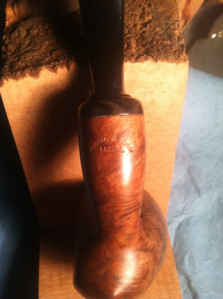
Thank you!Fatman":w8zeqkmy said:The stamp looks nice on the briar!
I like the way your stamp looks on my pipe, scottie.scotties22":sr9vdjns said:That looks great. How much did you practice before you put it on a pipe? I suck at stamping pipes.....I really hate it. They always come out looking like crap. Yours looks great. :cheers:
. I think the slight angle gives it attitude. speaking of, wait till you see how she is coloring, hidden flame grain is the hint. Give me a couple of more weeks and I will post some more pics.Enter your email address to join: