New Lamy Logo - stealth!

Brothers of Briar

Help Support Brothers of Briar:

This site may earn a commission from merchant affiliate links, including eBay, Amazon, and others.

Blackhorse

Trading Post Moderator
Staff member
Moderator
B of B Supporter
Council Member
Joined
Oct 23, 2010
Messages
13,300
Reaction score
1,917
Location
Oregon City, Oregon - USA
Just ordered a new (to me) Lamy Logo from Vanness...in matte black with matte black spring clip and fine black nib. Also picked up the correct converter and a bottle of Lamy black ink...just to be kosher.

The Logo is an extremely solid feeling metal pen...thin but weighty in the hand. The spring clip is very cool. Built like a German Tiger Tank. One of my favorites.

Note: German fine nib is equivalent to the Japanese medium.

First pic has silver steel nib shown...


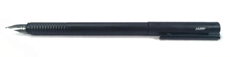
Here it is with the fine black nib (kinda hard to tell though)...


And with a few cousins...


Lamy, along with Pelican are the last of the German pen manufacturers who still produce writing instruments. My personal preference is for the more flexible nibs made by Pelican either steel or gold. Just a personal choice. Both firms produce excellent tools for writing as opposed to the pocet jewelry now made by that other German firm these days. :twisted: :twisted:
 
Si, mi amigo. The Japanese pen culture is thriving while Europe’s is waning methinks.

To me, Lamy is a singular company in their attempt to make each instrument an example of fine industrial design.

But if I were to pick an outfit that would be my “desert island” company it would likely be Pilot, Sailor or Platinum. But there are a number of small boutique brands that do a fine job with very interesting designs...like TWSBI, Noodler & even Nemosine, etc., etc. I won’t drag the Chinese into this as they represent a whole other thing.

Anyway...lookin’ forward to my stealth Logo. I just wish Lamy made their 1.5mm stub (etc,) in black. Oh well.
 
Blackhorse":bzuo2ufs said:
Si, mi amigo. The Japanese pen culture is thriving while Europe’s is waning methinks.

To me, Lamy is a singular company in their attempt to make each instrument an example of fine industrial design.

But if I were to pick an outfit that would be my “desert island” company it would likely be Pilot, Sailor or Platinum. But there are a number of small boutique brands that do a fine job with very interesting designs...like TWSBI, Noodler & even Nemosine, etc., etc. I won’t drag the Chinese into this as they represent a whole other thing.

Anyway...lookin’ forward to my stealth Logo. I just wish Lamy made their 1.5mm stub (etc,) in black. Oh well.
I'll have to agree about the Japanese pens. I own a red Sailor 1911 w/music nib and love it !! :twisted:
 
That pen looks very different, for a fountain pen that is. Speaking of pens I did buy a Pelikan last year, a B something, from my faulty memory. I really enjoy it. Now, the downside is that I am starting to get the fountain pen bug, aka FPAD. :lol!:
 
Falcon - the Logo is very cylindrical...tubelike...instead of the common cigar shape. And the diameter is less than most pens too. You either like the look/feel or you don’t. I appreciate the uniqueness...and th fact that it thevstandard Lamy nib will fit it...so a low cost switcheroo from ex fine to broad and the stub nibs too is possible.
 
Blackhorse":0hoelslk said:
Falcon - the Logo is very cylindrical...tubelike...instead of the common cigar shape. And the diameter is less than most pens too. You either like the look/feel or you don’t. I appreciate the uniqueness...and th fact that it thevstandard Lamy nib will fit it...so a low cost switcheroo from ex fine to broad and the stub nibs too is possible.
You can do the switch thing with Pelican nibs also. The nib/feed unscrews and you just screw in the new one !! I definatly appreciate the "industrial modern" loo to Lamys pens and pencils i just want more flex in my nibs than they have. Even Pelicans steel nibs have more flex than Lamy's . Just personal writing preferences. :twisted:
 
Indeed. I like a “soft” nib too. I like the stiff (regular) nibs for carrying in the field and use when not at a desk. Not much into “flex” nibs though.

How flexy is that music nib of yours?
 
Blackhorse":p54ise4c said:
Indeed. I like a “soft” nib too. I like the stiff (regular) nibs for carrying in the field and use when not at a desk. Not much into “flex” nibs though.

How flexy is that music nib of yours?
VERY!! if your'e not into "flex" nibs I'm afraid you wouldn't really want it ! When I want firmness in my nibs I use one of my '51's :twisted: :twisted:
 
monbla256":84fkry6p said:
Blackhorse":84fkry6p said:
Falcon - the Logo is very cylindrical...tubelike...instead of the common cigar shape. And the diameter is less than most pens too. You either like the look/feel or you don’t. I appreciate the uniqueness...and th fact that it thevstandard Lamy nib will fit it...so a low cost switcheroo from ex fine to broad and the stub nibs too is possible.
You can do the switch thing with Pelican nibs also. The nib/feed unscrews and you just screw in the new one !! I definatly appreciate the "industrial modern" loo to Lamys pens and pencils i just want more flex in my nibs than they have. Even Pelicans steel nibs have more flex than Lamy's . Just personal writing preferences. :twisted:
@BH: Yes, it looks thin. And Mike nailed it with the industrial modern look. That's exactly it.
@monblan: thanks for the tip. I was not aware of this possibility.
 
Top